“Nearly 50% of users surveyed by TikTok said that videos longer than a minute long were ‘stressful.’ The truth is that our attention spans are shrinking – so much so that the effect of short-form media on our cognitive functions has been given a name: TikTok Brain.” (Source: The Oxford Blue)
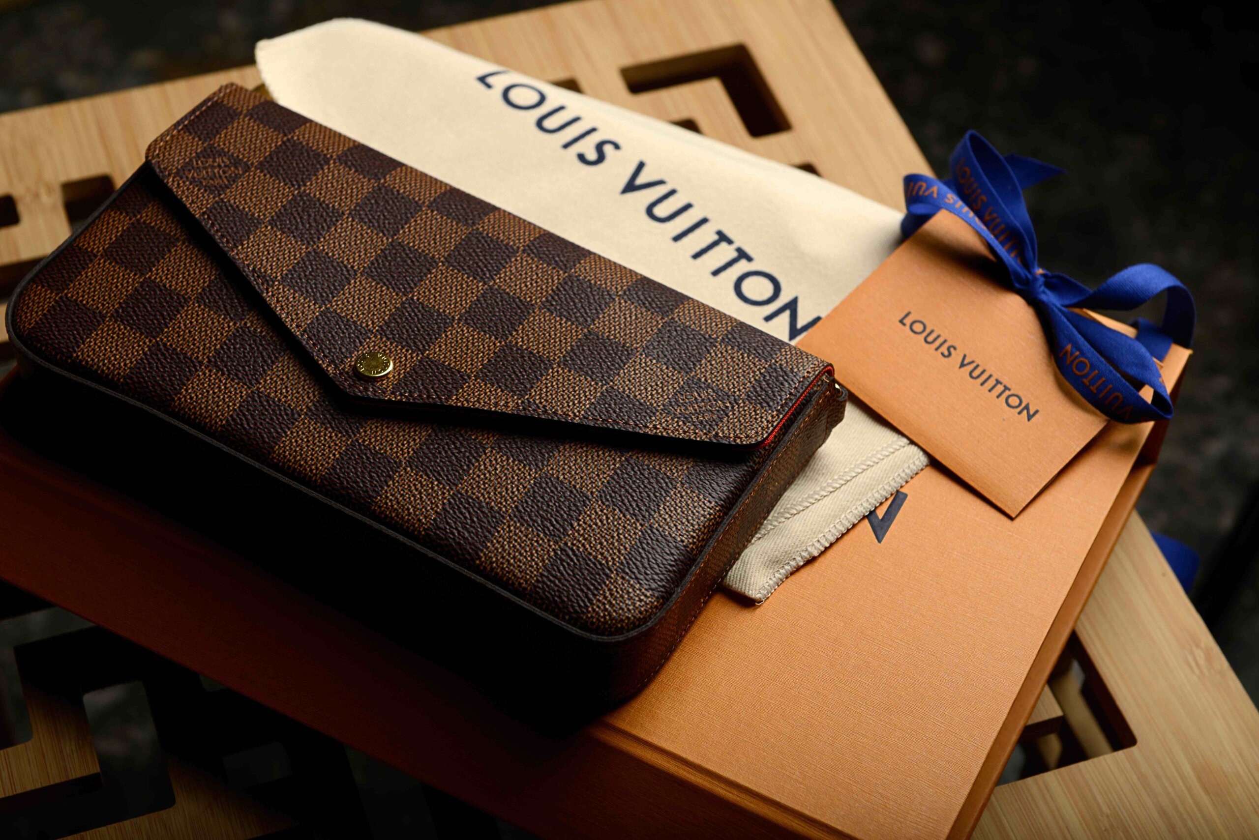
This statistic illustrates that the average time spent on social media posts is dropping alongside our attention span. For brands, it has become more important than ever to convey a visual message quickly. Showcasing a unique and distinct visual language.
As trends come and go, it remains tempting for brands to follow the latest wave to get noticed. However, having the courage of concept and vision seems to be sidelined and replaced by plagiarism and copycat marketing. This ranges from literally copying your competitor’s website to using trending templates on Instagram and TikTok. Brands run the risk of becoming dumbed down and bland, exactly the same as the others.
In this world of digital white noise, what better time to differentiate and position your brand with confidence?
In my book, “The Fashion Switch,” I unpacked my powerful five-step framework, which my clients have used to become fast-growth, award-winning investment magnets. In a world where customers are increasingly looking to shop for sustainable brands and from businesses with integrity, the framework becomes even more relevant. This is the second blog in the sequence.
Why Creating a Distinct Visual Language Is So Important
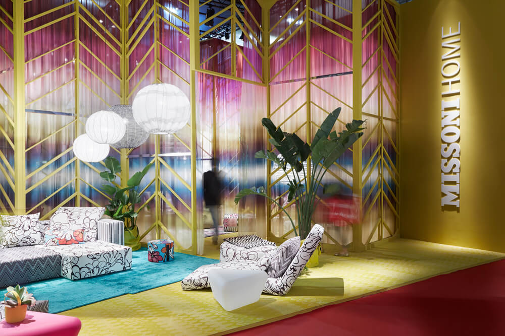
In my book, “The Fashion Switch,” I explain that with an authentic story already in place, successful brands need a distinct visual handwriting that is easily recognisable. If you were to look at a piece of clothing without branding from Missoni, it would be instantly recognizable. The same goes for a Dries van Noten blouse or a Mary Katrantzou dress – you’d recognize them.
This does not happen organically or by chance. This distinctness, this visual language, is the manifestation of a brand’s values. It’s something brands work out early on, and over time, it is fine-tuned into something exceptional.
“Take, for example, Dries van Noten. Someone could set a colour palette down in front of you, and you would say that’s Dries. The same with Armani, you know what his brand stands for and what to expect. The key, I would say, is it’s all about being you, creating what your product is, having your themes that are revisited, but emerging with that.” – Barry Woods, Managing Director, Life Fashion Recruitment
Consistently Express Your Brand Identity
The Power of Brand Authenticity: BoF recently unveiled “The Most Aligned Brands in The BoF Brand Magic Index.” Giorgio Armani, with whom I had the privilege of working closely in Milan, continues to be a powerhouse in brand perception. According to the AI-powered index, the brand secured the second-place spot, closely trailing Miu Miu.
My years of designing for Giorgio Armani, a legend and titan of the fashion industry, inspired me to write my book. The concept of aiming high, delivering consistency, and aligning your values and creative vision forms the core of my five-step ALIGN framework.
The BoF report concludes, “The Armani empire remains under the steady creative leadership of its founder, maintaining a brand image that remains understandable to its customers and consistently expresses its brand identity.”
So, the principles of my ALIGN framework have now been backed up by AI – that consistency of an authentic brand message with a distinct visual language at the heart of a successful mega-brand.
How to Start Creative Guidelines – A Case Study
A recent client case study serves as a perfect example of building a strong visual foundation before developing the brand further. We recently worked with The House of Colour.
The House of Colour business has a long history. Founded over 35 years ago, it’s been a leading colour consultancy well-known and loved in the UK. However, the impact of the digital and social media revolution in fashion and indeed all types of beauty and lifestyle businesses moved ahead, and their business was struggling to move with the times.
House of Colour knew that the image and message of the brand and services were still relevant but the brand image was not. Indeed, they saw that image consultancy was resonating with a whole new generation of clients, looking for experiences and ways to find confidence. House of Colour, a franchise model business, knew that there was a massive opportunity, yet the branding and visual language were not ready or relevant for the new audience, neither for their consultants nor the end client.
They needed a new and fresh direction, but as with all legacy brands, change and transformation had to be handled with care. Many of their loyal staff had been with their business for decades. Others were new recruits. Balancing what would excite a franchisee into the business and what would excite the customer was tricky. Finding a visual language that would translate well to the UK market but also to the US with a very different customer and franchisee demographic was a challenge. Marcus King, a serial entrepreneur and consultant, had been hired by House of Colour to help them find a new and different path. He had just read my book, “The Fashion Switch,” and approached me to see if we could collaborate. He arranged for me to meet Helen Venables, the managing director, and the board.
She explained that a new visual language was imperative to re-position and make the brand relevant. But she warned that getting the buy-in of everyone was crucial, and the whole business would be a delicate process.
How We Approached the Challenge
Step 1: Clarity – We started with a full immersion strategy ALIGN workshop with the board members. We covered all five foundations during the day, challenging the board to focus on and articulate their future brand opportunity and key foundations of their strategic aims. In this first step, we helped to unpack their Authentic Brand Message (ABM) in a series of workshops with board members. There were key messages that came to the surface. At the heart of the House of Colour business is the message of confidence building. “Our purpose is to help clients connect their inner self with their outer personality. Using our powerful proven style and colour systems, our mission is to help them look and feel amazing every single day”
Step 2: Insight – Following the workshop, we provided an ALIGN diagnostic report. We supplied the next steps strategy for the business to consider.
Step 3: Roadmap – We identified the crucial next steps. Establish the (1) Authentic Brand Message and purpose of House of Colour and then completely revise the (2) Visual Language of the business. We provided the timeline and step-by-step actions. This was a strong start. Simple and strong.
Make your mission and values visual
Step 4: Implement – So how does a message manifest as a brand identity? We provided that strategic foundation clarity and roadmap, working with the team and the board. Following the reflections and findings, we helped clarify their next practical steps for brand identity repositioning. In this exciting phase, we delivered.
- Copywriting for mission statement (ABM) and brand storytelling
- Presentation of Authentic Brand Message to present to the board and franchisees
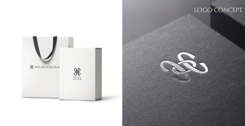
- Brand logo creation and brand guidelines
- Creative guidelines for printed brochures
- Creative guidelines for website and newsletters
- Positioning logo developments on DTC products
- Packaging design
Result
House of Colour has successfully re-branded and modernised its image and creative direction. The rollout was complex and took investment and time, but finally, the rebranding of every lipstick to compact, from brochures to colour consultancy tools, is all now elevated and beautiful.
This has enabled them to expand with confidence on digital channels. Their sales have increased both in the UK and the USA despite the effects of the pandemic. They have seen a huge increase in the recruitment of more diverse and aspirational franchisees and end clients. They are positioning themselves to expand into other international markets.
It has been a thrill after two years to revisit the brand and be asked to continue the journey of growing the business and brand. Earlier this year, we delivered a report on AI and its impact on the Fashion and Beauty sector and have now joined the company as a Non-Executive Director.
Benchmark Your Brand Foundations
A recognisable and consistent visual language on all platforms is vital to the customer experience and key to a long-lasting fashion business. Your collection will appear and sell on a range of different platforms, so it’s crucial that you establish and safeguard the visual integrity of your brand.
Larger businesses create detailed brand books that nail down every aspect of the history, vision, personality, and key values of their brand. It’s time to work out how your purpose and authentic brand story show up.
If you want to stress-test your brand’s visual language, then try these quick exercises:
- Are the visual touchpoints of your brand consistent?
- What key elements make it instantly recognisable?
- What makes it unique or distinctive from others?
- What keywords describe what your customer feels?
- What links all your visual language to your brand story?
This work is the backbone of building strong brand visual guidelines. It will help drive better results working with your internal and external teams and create a distinct identity for your customers.
Benefits:
- It brings everything back into focus.
- It clarifies your visual output and language.
- It creates strong brand guidelines.
- It strengthens distinctive visual touchpoints.
- It highlights inconsistencies in the brand vision.
Outcome:
The strength of creative vision and its consistency builds authority and credibility behind your brand. Linking this to your personal values makes it true and authentic. Many brands lack this creative confidence, so getting this right will make you stand out.
Client Testimonial
Successfully established for 35 years, House of Colour needed a fresher brand that would help transition the business into a younger market. Joanne was proactive and detailed and listened carefully to the brief before bringing her expertise to bear. We found the ALIGN strategy framework a highly effective system to use and easy to revisit as the business moves forward. Working together through the brand transformation was a pleasure. The new brand identity elements and concepts delivered by Joanne and her team were beautiful. Our aims are currently being achieved, underpinned by the elevated look and feel. I would highly recommend working with Yulan Creative
Helen Venables Chairman House of Colour
Has your business moved on from its old brand and vision?
Are you struggling to distinguish what you do from your competitors? If you’re looking to create a new distinct visual language and transform your brand to ALIGN with new values and positioning, then why not get in contact.
Joanne Yulan Jong is a Creative Strategist, Fashion Writer, and Author of the bestselling book THE FASHION SWITCH ‘The New Rules of the Fashion Business’. She has been invited to be a regular columnist for WWD magazine.
DOWNLOAD THE ESG PLANNER